
ACSA is an ERP web app that was developed for Aura Gemilang in 2018. The web app hasn’t gone through any major design iteration. On top of that, board members of the company are not using the app in their day-to-day operation.
ROLE
UI/UX Designer
SERVICES
UI + UX Redesign
TOOLS
Figma, Miro
MISSION
Throughout the years, ACSA saw little to no usage from the board members. In this project, I dive into the root cause and discover what could be done to improve the app adoption among the board members.

Here are the deliverables for the project:
RESEARCH
To pinpoin the exact factors, I conducted a survey via Google Form and sent it to Aura Gemilang’s manager. Also, I have outlined multiple research goals and uncovered crucial insights
Project description here to give context to readers. This allowed us to take on and finish more projects—fast—and earn more money.

1. Absence of crucial data impacted the app usage among board members
Based on the response, board members don’t use the app because they would rather ask their employees/manager upon request.
I have also pinpointed a number of key business metrics that they would consider important.
2. Low Hanging Fruit
Besides that, I have also discovered that clerks considered “Jumlah Advance Semasa” (Total Current Advance) in their dashboard view.
IDEATION
Before I dive deep into the design process, I went to Miro to gather, brainstorm and refine my ideas.

SKETCHES & WIREFRAMES
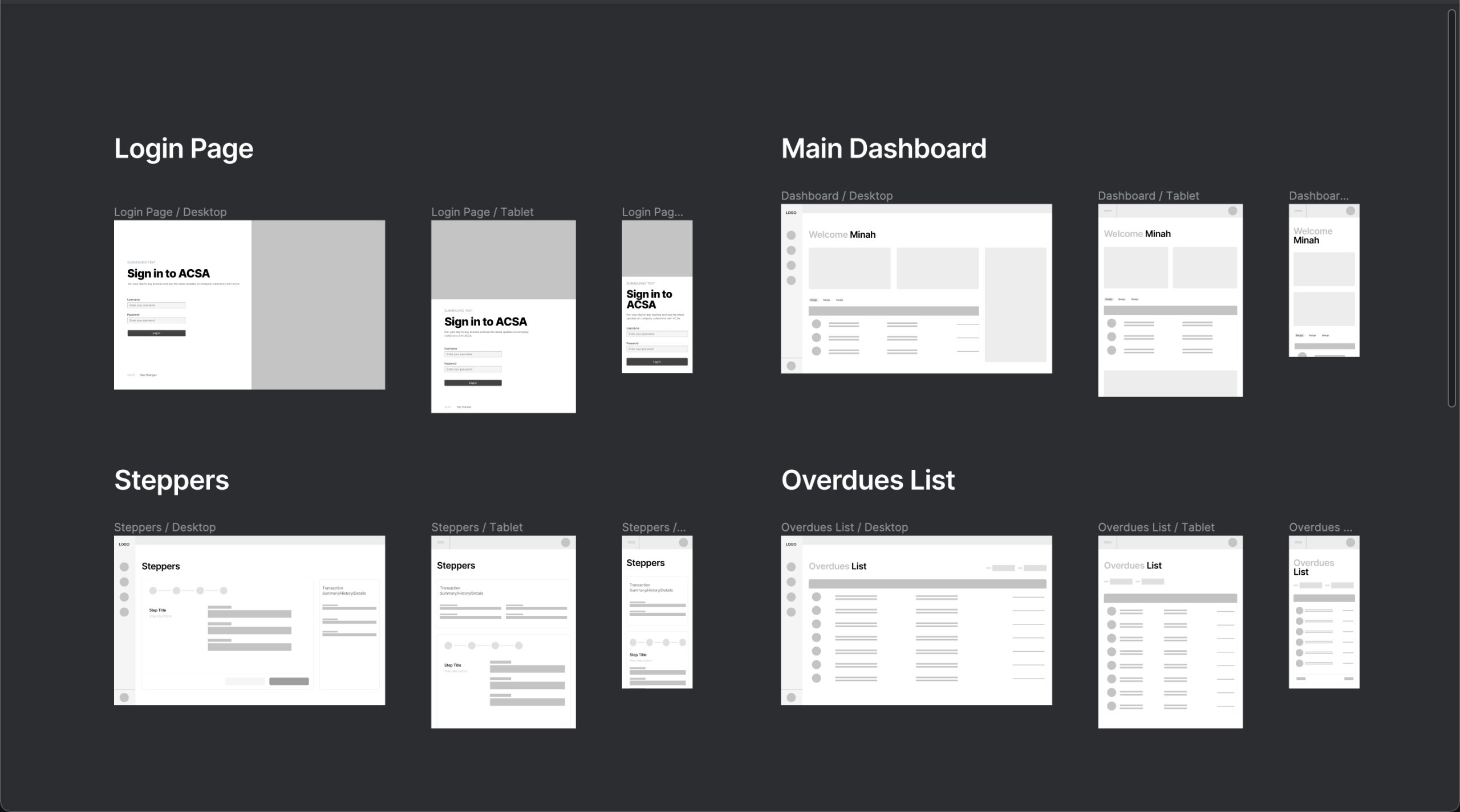
In the early stages of the design, I started with rough sketches on paper to experiment with layouts, later digitizing in it Figma as wireframes

STYLE GUIDE & MOCKUPS
ACSA was redesigned with a clean, visual look. Previously it had displayed little metrics in the dashboard, rendering it useless from the board member’s perspective.
With the introduction of Board Member view, I hope to increase the app adoption from these group of users.

OLD ACSA UI

Redesigned ACSA UI – Home Dashboard Screen

Redesigned ACSA UI – Commission Screen

Redesigned ACSA UI – Commission Screen

Redesigned ACSA UI – Responsive Design on Devices (For Board Members Use Case)
SHOWCASE
ACSA was redesigned with a clean, visual look. Previously it had displayed little metrics in the dashboard, rendering it useless from the board member’s perspective.
With the introduction of Board Member view, I hope to increase the app adoption from these group of users.